Tuesday 3 July 2018

The Final Word ....

So with the figures painted, it only remains to bring the shiny and matt bits together, to get a consistent finish to the figure. I do this by varnishing first with a brush on gloss, revell email color no1, and then, once dry I spray matt with Winsor and Newton Professional Matt Varnish. I find this gives a really good overall flat look.


And it's job done! (apart from the other 40 rank and file I have to do for the rest of the unit .....)

My last word on the figure style debate ..... (is it a debate? 😄 )

Here is the previous image line up with the addition of a scaled down image of an actual person dressed in a period uniform .....

I'll scuttle off now and leave the chunky boys to the feast .......

Bye

John

Saturday 23 June 2018

A Little about Figure Style

On a different tack ......

I recently attended a rather enjoyable wargaming weekend to help with running a large C18th game, using Charles's Grant's excellent "The Wargame" rules (other rules sets are available, ......they're just not as good! )

Anyway, the after dinner drinks discussion ranged far and wide, but at one point touched on the fact that the Crann Tara style figures look like they have been on a starvation diet etc.

So, I thought I would do a small visual comparison, between a Crann Tara figure, an Old Front Rank I happen to have, and a scaled down image taken from a drawing book, created to illustrate typical human proportions. Now whilst I appreciate folks come in all sorts of shapes and sizes, it is a useful benchmark I would suggest.


At the end of the day, everyone has there own taste, and I can see why chunky, cartoon style figures are popular (they are so much easier to paint, the head alone being twice the size at least from what it should be), but I know which style looks better to me .... 😉

Finishing Off

With the bulk of the figure complete, it's time to finish by doing the final detail.

The musket is painted with a deep brown colour, then highlighted with a light tan/orange hued colour (I used Foundry Spearshaft 13c). I tend to do thin lines to give a suggestion of wood grain, it's totally out of scale, but seems to work. Metalwork is then painted in, using Coat d'arms 142 gun metal and Coat d'arms 220 silver for highlights. The gold is first painted Foundry Spearshaft 13a then overpainted with an acrylic gold. I find most metallic colours benefit with an undercoat of a base slightly darker flat acrylic colour underneath as they tend to be quite translucent and it helps give them depth.

Hair is painted all in an acrylic colour, like a light grey or light tan, then, once dry, washed over with a suitable oil colour (like Blue Black or Burnt Sienna respectively). Lastly the tricorne lace etc is painted, again, in this case, Spearshaft 13a as the base, with Foundry Ochre 4c as the top coat.

In all this detail work, it's important to leave a margin of a darker colour between surfaces, it helps to define the areas and makes it really "pop".

At this stage the figure is basically complete, all that's left to do is to deal with the fact that we have shiny and flat finishes at this point. An easy fix, which I'll describe next time.


Friday 25 May 2018

Starting on the detail

With the core blocks of colour completed, it's time to start working towards finishing the figure by adding the detail. This stage of the process is very important, as, done well, it can help us deliver the third key element we are looking for, the "definition". 

My way of making the figure "pop" is to be quite focused when doing the detail to ensure that you paint in such a way that it leaves an effective "edge" between different colour areas on the figure. In the past some folk have thought that I lined figures in, in the way that Peter Gilder used to do, I don't, but the principle is the same. By creating a clear colour boundary and contrast on the edges of colours, you define them more clearly to the eye and make the figure much sharper and visually attractive.

If you don't do this than figure can often blend together in a way that means they get lost and it all just merges into a bit of an undefined mess.

So, on these figures I've done the following .......

The belts have been painted in with Foundry Buff Leather 7a, then 7b and finally with Foundry Base Sand 10c. Wherever there is an edge, eithet between the belts or the coat, I've ensured that its sufficiently dark to define the edge, in places this has meant a small amount of a mid brown colour being painted in.

The cartridge box was painted with Foundry Spearshaft 13c, allowed to dry and then washed over with Burnt sienna oil, I find this gives a nice tanned leather effect. The canteen painted in a dark grey then highlighted with some Coat d'arms Gun Metal 142, and then Silver 220.

On the buttons, these are painted in Foundry Spearshaft 13a, and then gold acrylic applied on top. I make sure that the base brown colour covers the full button and a little bit more so that when the gold is applied it leaves a very small "edge" of brown behind, This helps really define the button and make it pop. Look at the buttons on the coat, the coat is yellow and the buttons gold, without doing this they would just be totally lost. It takes a little practice, but makes a huge difference.

With the detail now done on the core figure, next time I'll move on the the musket, hat, hair and complete the figure.

John

Saturday 19 May 2018

Progress on other things

Taken a break from painting last couple of weeks, but will be picking up the brushes again now. The work in the interim has been on finishing the French Dragoon Command:


And also doing a conversion to create a suitable Grenadier figure for the unit currently being painted:

Back again soon ....

John

Wednesday 25 April 2018

Two out of three .....

A bit more work on the figures has now progressed them to the stage where the main core colours have been completed.

In my mind, this achieves for us two of the three criteria that I first identified as objectives for the figure painting. Namely, we've got good depth and strong bold colour. My camera work is amateurish ( a single overhead lamp on my workbench) and it's a very old digital camera, so the images shown don't really do the figures justice in that respect. "In the flesh" the colours have a really nice depth, vibrancy and tone to them, but are still quite subtle in overall look.

So, the steps since the last session were .....

The blue was done using acrylics, mainly because I find oil washing on deep blues doesn't work that well, I find it's just a bit too translucent. So, I use a three layer approach using Andrea paints blue paint set. I really like these acrylics, they have good pigmentation and dry quite "flat". In this case it comes as a six tone set, my technique here was to go from 2nd shadow as the under layer, with the base colour on top, then moving to the 3rd highlight to finish. Effectively I've accelerated through the six available tones using the ones on either end stopping off in the middle along the way. It creates a fairly strong transition, and on a bigger surface are you might want to introduce a few more of the intermediate tones, but at this scale it works fine.

The gaiters were then completed by highlighting them with Vallejo Ivory 005. That pallete (using the wiped off Gold Ochre oil wash) is my "white" and is the white I use on all my figures. It's warmer and less harsh than many you will see.

Details on the gaiters were then painted black and then highlighted with a suitable mid grey for the straps and light grey for the bone buttons.

Lastly the yellow was completed by highlighting with Foundry Yellow 2c


So, now we have the core figure well on the way, further steps will be to add the detail, doing this in the way I'll show will provide us with our last element .... the definition 

John


Friday 20 April 2018

The Heart of the Miniature

Is, in my opinion the face. It gives the figure life and is the aspect that makes us believe its a little human being.

For that reason I always like to paint the face early on in the process. It sort of makes me feel like the figure is coming alive and helps me push on to get the rest of the painting done.

So a few rules I apply to face painting on 25mm (I'm old school! 😁) figures .....

1. Paint the face to the very best of your ability, time spent on this aspect of the figure will pay you back more than any other element of the paintjob. A well painted face on an otherwise "averagely" painted figure will still look like a good figure overall, conversely, a poor face on an otherwise well painted figure will really drag the rest of the figure down.

2. Do not paint eyes on 25mm figures, unless you do this perfectly (and I do mean perfectly) it will ruin the face, make it look like a google eyed zombie, add nothing, and take your time to no real value.

So what's my technique?

I have five steps ......

1. Paint the whole face (and for that matter any other flesh on the figure) with Foundry Flesh 5a
2. Once dry, wash over with Coat d'arms Ink wash "Chestnut"137 (this is an old Citadel paints wash that I used to use when they made it, it worked for me and I've never changed, luckily it's still being made by someone else under this brand)

Having done this the face will look like this
Once the wash has dried (won't take too long as it's only water based). I then do the following

3. Repaint the face with Foundry Flesh 5a, but this time leave the deep recesses still showing the underlying colour
4. Highlight the bulk of the raised parts of the face with Foundry Flesh 5b
5. Finish by adding very small amounts of Foundry Flesh 5c to the bridge of the nose, the upper cheeks and point of the chin only.

The overall effect will be something like this

It's a fairly simple variation of using the standard foundry "flesh" palette, but it gives a really good effect (well at least I think it does! 😊)

So, now the figures are "alive" time to start adding more colour .....

Sunday 8 April 2018

Wash time

No, not your once a week bath ..... 😊

Having blocked in our first key colours on the coat and gaiters it's now time to apply some oils.

The key principle here is that I have block in a very light "version" of the underlying colour that I want, and then wash over with oils. This provides the benefit of providing a solid base of the colour underneath the oil wash, whilst still allowing the depth and the richness of the oil pigmentation to "shine" (it does quite literally, but we'll deal with that issue later). It might not come across that well in the images (I'm using a 10 year old digital "family/holiday" type camera under a spotlight), but take it from me, the richness and depth you get using this technique is subtle but really good.

So in this case, I've used two oils in the form of a wash, the yellow is Gold Ochre, the black is Blue Black (I only use Winsor & Newton Artist Oil Colour, so take that as given on all the oils from here).

First step

The Yellow is applied to the gaiters first, this is because I am actually going to be making these white/canvas. To do so, I apply the yellow wash, leave for a few minutes, then wipe of roughly with a small piece of sponge. This has the effect of "staining" the area, without making it a strong yellow. I find this works very well for a base for a "white" top layer, although I never actually use white on any of my figures.

Second step

I next use the yellow wash and overpaint the coat. In doing so, try to stay within the previously blocked in areas. It doesn't matter too much if you go over a wee bit, but try to be neat as it helps retain the definition of the edges.

Third step

Using the Blue Black wash I over paint the shoes and tricorne.

The figure should now look something like this:
They now need to be left to dry.... (make sure you do!!) Working in batches will allow you to overcome any delays, by switching between working on oils on one set whilst then prepping the acrylic's on the next.

Next time faces ....

John

Sunday 1 April 2018

Paints

Before I go further with this, I want to say a little about paints. I shall add all usual disclaimers, I am not a trained artist, my views are based purely on my experiences as a layman. Others will no doubt know much better 😊

I used acrylics for many years, having moved on from good old humbrol enamels, mainly because acrylics are quicker and easier to use and the water based nature of them makes life so much easier and less fume filled.

However, a number of years ago I became disillusioned with the "modern" style of wargames figure, increasingly I saw them as gross caricatures of human beings, usually a cross between an orc and a gorilla. Sure, they are easy to paint, but I just really stopped liking the look of them. I progressively moved back towards more anatomically correct, slimmer figures, many of these being from older ranges.

There was a problem though, these figures are much more challenging to paint well. You have to really "paint" them to get them looking good as opposed to the "paint by numbers" style you can use with modern, chunky figures. I found my technique and the paints I was using weren't really achieving the look I wanted.

I knew that "back in the day" most of these figures had been painted using enamels and oils, I didn't want to go back to using enamels, so started playing around with Oils.

Using Oils was in one way a revelation, but also a bit of a disappointment. I could see that the Oils had so much more richness and depth of colour, but they were really hard to use and also looked "washed out" when used alone with a white primer. What to do .....?

I started to experiment using a mixed medium technique, acrylics and Oils together. This has a fundamental problem though ...... As we all know, the two solvents involved, Oil and Water, don't as the phrase goes "mix". How to get round this? The secret is that you must, must let either the acrylic or the Oil thoroughly dry before going anywhere near it with the other medium. If you do so they are compatible, the only exception being that sometimes the acrylic might struggle a little to "grip" on a previously oiled surface. It will, with a few additional strokes of the brush and it only happens occasionally, so I put up with it.

Anyway, that's enough boring text for one post! 😊

On to the next stage.

Blocking in

So, with the figure primed and then washed with raw umber (When I say a wash I mean a small quantity of Oil paint, a bit on the end of a matchstick, mixed with a few drops of Liquin till it makes a solution of the colour concerned which has the consistency of thin motor oil) I leave to dry for at least 24 hrs until the Oil paint is dry (it can take longer). The use of Liquin is critical in this, as it serves two functions, it thins the paint to make the wash, but it is also a drying agent which makes a huge difference to how long the Oil wash takes to dry. When I was going through my "trial and error" phase I once painted some horses with oils, which, several years later, still weren't fully dry!

Once dry I will then block in the first basic colours, which I will subsequently be over painting with Oils. In our example I've painted in the Coat and gaiters with Vallejo Acrylic 007 Pale Sand and the shoes and hat with Foundry Artic Grey 33A. In doing so I am filling up most of the surface but allowing the underlying raw umber wash to show through at the edges and also in any deep cuts or folds (similar to how you would if doing the "black undercoat" technique). The figures will then look something like this ...

Apologies this runs to much more text than I'd hoped, don't worry the text/image ration will improve once I've managed to explain the bulk of the technique as we progress forwards.

John


Saturday 31 March 2018

Let's start at the very beginning .....

A very good place to start ....

My "painting journey" (How pretentious, and I'm not even an artist!), began many moons ago, and like many, I've evolved through the usual phases of Humbrol enamels, black undercoat, acrylic layering etc.

About 10 years ago (about the time I started trying (badly) to make figures of my own), I started to think about what I was trying to achieve with the painting, I took it back to first principles and have experimented and evolved my technique ever since. In these posts I'll try to progressively explain why I do things in certain ways, whilst we walk through the painting of the unit. I'll try to keep a balance between "boring" text and images (likely to be more explanation at the start), but let me know if I'm saying too much!

I would argue that to make a figure look great, you need to achieve three main objectives, depth, colour, definition (other things may come to mind as I ramble on! 😄

So, all figures start with .....

Undercoat or Primer

Most folk, painting most things, start with a white or at least "light" primer. The reason is fairly simple, most paints don't fully mask the colour underneath them (unless you put them on very thick or in several layers). The colour underneath "bleeds through" and impacts on the colour on top. That's why most paintings, walls etc start white and then get painted on top. Not many of us would undercoat a wall black before painting it a light yellow for example.

So why do so many figure painters undercoat figures black? The answer is easy ..... it's a bodge, it's a quick way to create depth and definition by allowing some of the black to show through at the edges. However it's very crude in both respects and it directly impacts on our third objective colour. I would also argue that you can make a figure with a black undercoat "decent" fairly easily, but it's actually quite hard to make it really "good".

So ...... it's white then? Well err yes, but, as most folks painting figures know, a white undercoat is a pain, miss even the smallest bit and it shows and looks crap, also, while it helps with colour, it adds nothing to depth and definition.

So, the solution?

Mine is to Prime white, but then wash over with a suitable darker colour, which, importantly only lies in any strength in the creases and edges. Doing this "helps" us with all three objectives. The wash doesn't overwhelm the white primer, so it still helps us with the "colour", the lining effect which the wash gives us helps to create "definition" between different surfaces, and the gradation it produces on wider surfaces and curves helps to create a degree of "depth".

So in the next step on our figures I have washed over with an Oil paint and Liquin mix, in this case the Oil Paint is Winsor &Newton Raw Umber Artists Oil Colour

Shown for illustration is our first company of the rank and file (who are being painted in parallel with the command, so we'll alternate between the two as we go).


Next time I'll talk more about paints and show the next steps ....

John


Friday 30 March 2018

Building a new unit

I'm just about to commence creating a new unit for my slowly evolving C18th project based in Italy in the 1740's (Great period and theatre, much overlooked), and thought it might be informative to folk about how I go about it.

I'll start with the unit composition, and run through painting, basing, making the flags, the whole shooting match. At my rate of progress that'll likely be progressively over the next couple of months of hobby time (I'm not rapid, but like to think it's quality not quantity! 😉 )

So, first things first, unit composition .....

Unit Composition

My units are put together for use with "The Wargame" rules by Charles Grant (other rules for this period are available ..... they're just not as good! )

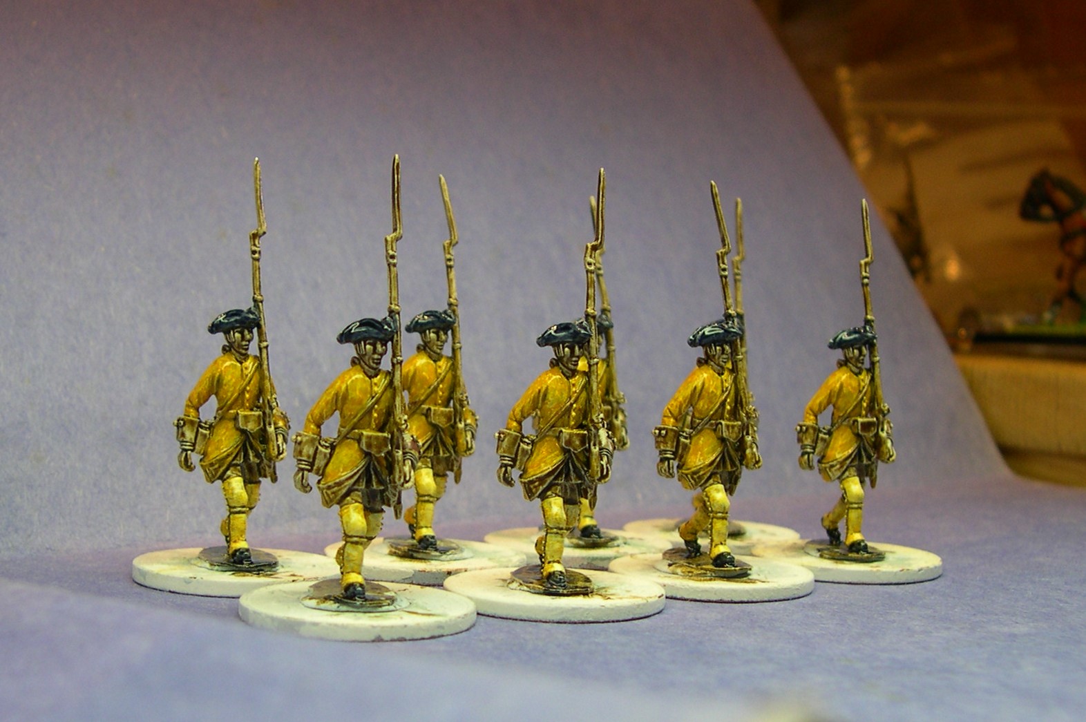
So the basic infantry unit is 48 rank and file, yes that's considerably more than are a lot of folk are used to painting for a unit, but they do look damn good when complete. They also help deliver the mechanics of manoeuvring linear warfare units on the table very effectively (far too many wargamers love their "nippy" units way too much!)

Now in Charles's rules, the morale/command/cohesion of a unit is represented in the officer figures, for a line unit this would be four officers at one point each and a Colonel at two points, giving six points in total. Now, one of the things I really like about John Ray's fabulous collection is his use of vignettes to augment the visuals of the big units on the table. I therefore do use Charles's points system, but don't have them as single figures. Rather I create 5 Vignettes (typically of a couple of figures) to represent the equivalent "points" outlined above. Still keeping up with the "thread"? Good 😊

So my unit will have 48 rank and file and 5 Vignettes, in this case, The Standards, the Musicians, two times an officer with accompanying NCO, and a Colonel (mounted) with a supporting officer on foot.

In this case that will make 60 figures in total (I can here the exclamations already! Stick with me and I'll convert you)

Unit Selection

Ok, because I have the castings, and I fancy starting something new, I will paint my first Spanish/Neapolitan unit. From this point on, I will call them Neapolitan, although technically you could as easily label them as Spanish (as many of the units actually were).

Let's pick something colourful, I haven't painted a unit in yellow coats yet, which I think is an attractive option, so I've picked the Neapolitan Provincial Infantry Regt Basilicata, a pleasing yellow, with blue facings and brass/gold metalwork.

Figures

Easy! I'll be using my own! 😃 So it's Crann Tara Miniatures, Spanish marching foot figure for the rank and file, with command made up of a combination of French command figures (Not made by me) and various Savoia figures lightly tweaked to suit.

The Start

So, figures selected, ideas around the vignettes worked out, I then prep the figures with Halfords spray white primer. And here are the command

So we have (L to R) the Musicians group, The standard bearers and NCO for protection, The Colonel (sans horse) and foot officer, Standing Officer and NCO with Halberd, and Advancing NCO (and officer who's advanced off screen slightly)

Next .... The painting begins ....

(I know this has been text heavy, but trying to give a bit of background to what I'm trying to do here)

Thursday 29 March 2018

Ted Suren - a largely forgotten figure making Genius

Not been "Blogging" for a long time, my web activity been pretty much focused within the bounds of the "A Military Gentleman" Forum for the last few years. Sadly that has now closed, so I've been reflecting on what (if anything) I do internet wise from here.

Still made and painted a reasonable number of figures (for my speed) over last year or two, but not been posting anything. We shall see.

Anyway, just finished painting a few Ted Suren figures for an upcoming C18th campaign. This chap in particular I think is just an outstanding sculpt. So much life and character, has anybody ever done anything better at this scale?